Categories
conference presentations

SQUEEE!!

A Squee Moment In The Middle Of My Day

Borrowing a term from Christopher Gould of MOBIUS, I had a squee moment as I was checking my email today. The conference that I went to last month (National Association of Government Webmasters) sent out the compiled evaluations to presenters. They put them all neatly in a spreadsheet, gave averages for each 1-5 rating and included the comments on the same row as the rating scores. I felt that, according to the number of drinks purchased for me the night after my presentation and the number of people who commented favorably on it as I was imbibing those drinks, the presentation had gone well. I had no idea *how* well, however.
My average scores, on a scale of 1 (lowest) to 5 (highest) were all above 4.2 – most were in the 4.5 or 4.6 range. The “average of my averages” was 4.5 out of the 36 people who turned in evaluations. That’s a lot of 5’s!! The comments, though, were truly wonderful. I did have some constructive criticism (one person felt that my visuals needed more color) and I LOVE getting those – they help make the next presentation better – but much of the commentary was positively blushworthy.
Stuff like, “Very interesting subject. Great presenter.” and “Perfect balance between technical and non-technical info. Engaging presenter. Would love to hear from her again!” and “Great content. Well done. Thanks Robin” were enough to make me giddy. You better bet they are going on my “raves and reviews” page!

Categories
presentations

A somewhat delayed NAGW overview

Coming back to work and getting back in the swing of things took the wind out of my sails… I haven’t had a chance to sit down and regurgitate (lovely image, eh?) my experience at NAGW yet, but now I’m sitting at the public computer desk at work and have a few minutes, so prepare for some thoughts!
I didn’t post much about the last day, mostly because I was a bit under-the-weather (read “hung over”) that morning and slept all afternoon to make up for it. The morning session, a preview of IE8, was interesting, but not groundshaking. There were some interesting bits coming out of the Microsoft camp – nothing that can’t be recreated in Firefox with a nice extension or two – but nothing earth shattering. The Web Slices thing is also something that is nice, but not necessary and will just cause more work for webmasters when something like dapper.net is already available for the few sites that don’t already produce RSS feeds. IE8 looks good, but it won’t cause me to toss my Firefox install any time soon!
After that, as I said, I slept until it was time to go to the Zanies Comedy Club to see Kevin Nealon. That was a lot of fun and very, very funny to boot! I enjoyed myself immensely. Then it was straight to bed and a 7 hour car ride home.
Now that I’ve been home for a few days and have had a chance to digest my experiences at NAGW (see, there’s that regurgitation thing again – I’m sensing a theme), I’m ready to let you all know that this is one of the best conferences I’ve attended yet. It was small and intimate (so we all ate together and that fostered a sense of community) but it was also packed with quality information, vendors and “stuff”. The bag and swag I got were phenomenal! I was duly impressed…
Next year’s conference will be in Galveston, TX and I’m truly hoping that I will be able to make it. It’s almost twice as far from me as Chicago is – that might be a bit of a stretch to drive and flying is always a “can I find a really good price” sort of thing.

Categories
conference

Adobe Photoshop CS3 for the Web

Lunch was sandwiches, pasta salads, chicken soup and apple turnovers (for me at least, they always have a great selection of food…), the next session after lunch was:

Adobe Photoshop for the Web
Jim Maivald from Adobe

Started with discussion of the upcoming CS4 suite – just that it’s coming out and will be a “free” upgrade if you buy CS3 within 60 days of purchasing it. Also offered free day of training if your order is 50K or more. Not really in my league…

Next he opened up Photoshop CS3 – immediately opened a photo and started showing how to use the levels palette to adjust colors, both simply by adjusting black and white and by using the 3 eye droppers (white and black) to tell PS how to identify those colors.
He opened the curves palette next. He showed us how to preserve the rest of the image by putting anchors on the curve line while messing with pixels in other parts of the images.
Shadows/Highlights pallette followed. He demonstrated using this palette to do some sharpening of the picture without *actual* sharpening.

New selection tool – magic selection has become even more magical! Click & drag to select – make sure the “target” icon is in the area you want to keep. He then showed how to change pixels after you’ve selected them without being destructive using the adjustment layers (allows you to add make limited changes that are applied in a layer without changing/destroying the original pixels).
Smart Objects – a photo that is captured and stored somewhere secret that will allow you to make changes in any way, but will keep all the pixel info of the original in the smart object – (right click on layer and convert image to smart object) – do your work, any filters used will be smart filters – double-click on the filter in the layers palette and make changes to the filter properties, add filters to the smart object, make all kinds of changes without it being permanent!
Showed photo merge with new layer automerge capability – each image becomes a layer that can be merged several different ways. Showed really cool technique where several pictures with different people looking off to the distance were taken and merged them, then masked the top layer over the faces that were facing off camera and bring up the face where they “were” looking at the camera.
Rubber stamp tool – I’ve played with it before. He discussed cloning with perspective, which is somewhat difficult. He showed us vanishing point, a tool that lets you define an area with perspective taken into account.

Black & white conversion was next – lots of ways to see what your photo will look like in B&W.
At this point, he’s talking so fast that I can’t keep up… I’m doing a terrible job with the note-taking, but I’ll keep trying!!

Umm, I lied – check out the Zoomify stuff in CS3 – that is cool, lets you put a zoomable pic on your site with code that is created start to finish in Photoshop. Nifty!

Mentioned Device Central (lets you see your images as a cell phone screen would show it) and went into a bit of a disscussion on how people in a few years *won’t* be accessing your sites via the web on a computer, they will be accessing it via their phone, tv, refrigerator… and that’s why XML (which is the “big daddy” of RDF, XHTML, RSS, etc.) is so important. A direct corrollation to my previous session!!

Finished with a discussion of animation in Photoshop (while talking to his computer – which cracked me up, since I do that *all* the time!)

Next is vendor time and possibly nap time, then the Pinnacle awards banquet time!
Categories
conference presentations

My Session – Web 3.0

Wow. I was way more nervous than I thought I would be – first time doing this one, you know. This means that I practiced and re-thought the presentation a lot!! It seemed to have paid off. The presentation was very well attended with lots of people paying pretty close attention to a LOT of information thrown at them in the space of about an hour. I talked for a bit over an hour, then we had a really, really good discussion for the next 20 minutes or so. There were a lot of people who were really thinking while I presented and had some great comments and observations. I’ve already made changes to my wiki in response to the discussions from the end of the session!
The wiki was well received as well – lots of people commented that they really liked the idea. It’s something I’ve been doing for EVERY presentation I do these days. Something else I did, this idea came from my co-presenter for the Becoming 2.0 class, is to get a label for my cards with the wiki’s address and slapped it onto a bunch of them for take-homes. They went pretty quickly, too!
All-in-all it went very, very well. I’ve been talking RDF and XML with folks all afternoon – and it’s been fun!

Categories
conference

Opening Day – the overview

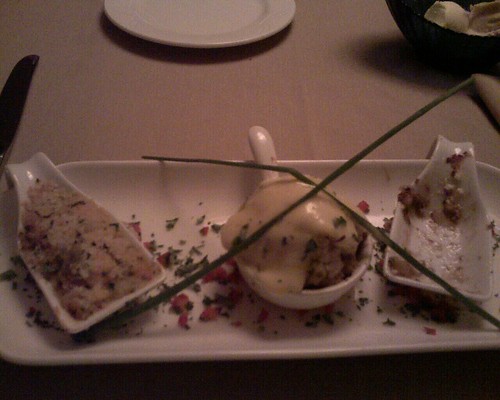
Again, I’ve already posted my observations about the opening talk, breakfast and both sessions, so I won’t go into that here. This is all about tonight! I made reservations for 7:30 at the Harvest restaurant, and wandered over that way for dinner. Amuse-bouche trio I started dinner with the Amuse-Bouche trio, which was described in the menu as:

Starting with grilled baby Portabello Mushroom stuffed with creole crabmeat glazed with hollandaise
Accompanied by seared smoked duck with pancetta root vegetables, caramelized onions and goat cheese
Finishing with crayfish etouffee topped with asiago crust

Yeah, it was that good. I also had a glass of Monterey, CA Reisling (I can’t remember the vinyard now) to go with the meal and had with it a Thai curry marinated Halibut on a bed of wilted spinach served with wasabi/fennell mashed potatoes with carrots and asparagus sticking out of it (this is from memory – it’s not on the menu posted on the website…). That was all covered with a tamarind sauce and had caramelized onions and on it as well. Thai marinated halibut w/wasabi & fennell mashed taters It was all seriously yummy! Now I’m back in my room and will go over my presentation *one more time* before I hit the sack and get ready for my turn to speak tomorrow!

Categories
conference

Flexible CSS Layouts

Design Services Manager at UNC Highway Safety Center – author of a couple of books as well.

Flexible design = overall width of layout is not fixed number of pixels (liquid/elastic/hybrid)
Why bother? Why not?
When fixed width makes sense:

* lots of fixed-width content
* known users with known setup
* beginning designer
* just need to get something small and simple up quickly

Benefits of flexible layouts

Design differently! – Not every design comp can be turned into flexible layout, learn what design features are (and are not) flexible friendly

Discussion of how height shouldn’t be fixed – you never know what size font your users are viewing…
Avoid irregular shapes that force a particular height on your text – unless you can tile some portion of the shape
Avoid text matched with images that can’t expand – pick the right images, or mask the image part out so that it can slide along a tile-able background (be sure you use proper CSS to ensure text has enough space to sit in) or use variable cropping (CSS crops the image to make the image look good in a narrower column)
Variable cropping:
div {
width: 50%;
min-height: 100px;
background: url(image.jpg) no-repeat;
}
put this div as empty
or
div {
width: 50%;
min-height: 100px;
overflow: hidden;
}
put image in this div
Blend into background – blend the background into the image to allow image to slide around the div without looking bad
Scalable Images
Liquid image
width: 50%;
Elastic image
width: 20em;

Avoid fixed-width, full width content (images that fill the entire column) – use same solutions as above (variable cropping, scalable images, etc.) or just don’t fill the entire column!
Composite images
use background position property and properly designed images
Scrollbars for large content
overflow property:
div {
overflow: auto;
} – on the *containing* box, not the image itself

Avoid horizontal alignment across columns
Solution – accept misalignment

She then showed us a screenshot and the audience gave reasons why the image would be difficult/impossible to create in a flexible manner. This was followed by a “redesign” of that same site with the ability to create it in a flexible way.

Flexible design inspiration – www.zomigi.com/blog/inspiration-for-flexible-web-design

Q&A
Flash? Can it be resized? Yes, it can be, google for scalable or resizeable flash and you’ll find it.
Text resizing widgits? Should they be used? – no strong opinion, but never used them herself – depends on your users. Put it in and test, check to see if it works!
Font-sizing? She uses biggest text size she can get away with (never below 80% if she can help it) so that those who have learned how to use their browser font resizing tools aren’t punished.
Standardized ID/Class names (a la Eric Meyers) to allow users to create customized stylesheets? Great idea – but do what makes you comfortable about allowing your users to change/alter your designs
Boxy designs – how to avoid, overlapping, perhaps? That’s fine, but make sure you have space below/above to allow text to resize. Check CSS Zen Garden for ideas on non-boxy designs.
Final note – browser zoom capabilities – why bother with flexible layouts? Doesn’t really help it for liquid layouts – makes the text too small to avoid horizontal scrollbars, etc.
How much work do you put into cross-browser support? All browsers should be able to read the content. Test first in FF, then in IE. (checks down to IE 5, but only to confirm readability)

All done – she’s giving away one of her books now – and I got it! A training video from Lynda.com called Web Accessiblity Principles. Sweet!!! (I answered the question of who came up with Faux Columns first – it was Dan Cederholm)

And now I’m talking to Zoe’s mom!!

Categories
conference

Adobe Forms

My first “real” session of the conference was on Creating Forms with Adobe Acrobat (specifically versions 7/8) by David Williams from Chester County, Pennsylvania.
The first thing I discovered was that users could save typed up forms in Acrobat Reader – if they had the proper extension. There was some discussion that this might only apply to version 7 – 8 may let them do it natively. I’ll have to check when I get home – if that extension is available, I’ll put it on our PCC machines! The next thing I learned was the Forms –> Form Field Recognition command. That will save me a BUNCH of time when I’m creating all the forms that came to mind as being useful to us at MRRL during this session! He then gave a tour of the editing form field process and properties, much of which I was pretty much unfamiliar with…
He showed us, during that tour, a neat trick with the fields – if you control-click and drag a field, you will copy and move that field so that you have a fully filled in field in a new place that only has to be tweaked, not completely re-edited. Pretty darn cool! He also showed us the comb feature – you know those forms that have boxes that require one letter or digit per box? Adobe will recognize those and make ’em work just like they are supposed to.
He went through customized field masks and how to create arbitrary masks to define your own data formats. He also showed how to create groups or hierarchies of fields that you can then use to make other actions like calculations easier. You can make this happen just by naming the field with the group.field naming convention.
Buttons can submit form to an URL (perhaps to a III Patron API URL that would let us auto-add library card apps to III….)
There was some discussion of the signature option, which creates a completely un-verified local signature for the user. When asked later about the legality of that, he suggested that we each check with our lawyers!
A final trick he showed was to make small changes to a form, add the new form using the Document –> Replace Pages command to slide the new document below your existing form fields so that you only have to tweak, not completely recreate the form.

Categories
conference

Breakfast and the keynote speech

Man, they really know how to feed a gal! Breakfast this morning consisted of scrambled eggs, biscuits and gravy, pineapple, bacon, cinnamon-raisin toast and grapefruit juice with coffee & water at the table – and that’s just what I had for breakfast, there were donuts, yogurt cups, omelets and sausage links on the buffet table as well. The table at which I sat had more than a couple of mothers with teenagers (myself included, of course) so that took up the majority of the conversation. We were joined by a gentleman who came to the conference from Holland (that’s a long way to come for a webmaster’s conference!!) who was very interested in my upcoming topic, Web 3.0. The discussion of teenagers and upcoming web technologies kept our breakfast table an interesting place until the keynote speaker began.
Joe Patella, Chief Technical Officer & Usability Practice Director of Delphia Consulting was our main attraction today. He gave a wonderful talk on “We the people: Are they really the center of your design process?”. Some of the highlights of his talk are:

  • Clue bus – an actual bus he keeps in his office to remind his staff when they’ve fallen off the clue bus (as in, aren’t getting a clue about user needs in their designs) and need to get back on. Very cute idea!
  • 5 D’s
    • Define – user requirement gathering
    • Design – identify info objects of import
    • Document – style guide, etc.
    • Develop – test & iterate
    • Deliver – roll out production site
  • Tech that helps, not hurts!
    • What works best for your content contributors?
    • Repurpose content
  • Think “content” not “webpage”
  • Info repositories – Los Vegas City site used Services/Departments/Audience to define each document or piece of information and then made the information accessible via the service, the department or the audience that was applicable to (this could be done with Drupal’s views and might be an excellent way to structure MRRL’s site…)
  • User-Centered Design is a process approach
    1. Know your users
    2. Set visibility goals
    3. Organize information, both on the site and *about* the site
    4. Make a great impression
    5. Validate your ideas (testing!)
    6. Coordinate design of the total user interface
    7. Evaluate and Iterate
Categories
conference

Preconference day

Well, you all have seen my posts from the preconference sessions themselves, so I won’t go into that, just the “around the sessions” stuff that happened!
During our first break, I had a gentleman with a vaguely UK accent (later found out it was Scottish, but he’s been in the US for 15 years, so it’s subtle) ask me if he could be cheeky and steal a cigarette. I immediately started giggling and had to explain that I had promised myself, during my recent trip to England, that I was not going to giggle when asked for a “fag” from anyone. Of course, if you read my blog you know that I did giggle when it happened.
Lunch was a turkey sandwich, pasta salad and a HUGE chocolate chip cookie eaten outside on a slightly chilly but perfectly sunny day. It was provided by the conference (the lunch, not the day) and was wonderful! After lunch we trooped back in and hit the second preconf of the day.
After that session was over, I came back to the main part of the hotel, ate dinner and found the gift shop (located on the recreated Bourbon Street inside the hotel) and picked up some toothpaste and a razor. Ah well, if I remembered everything all the time, I’d be perfect and you’d all hate me, right? I did actually bring a very nearly empty tube of toothpaste with me, but that will do me no good later in the week…
Now I’m back in my room, chilling and checking my makeup before I head to the opening reception – also held in the recreated Bourbon Street area of the hotel – where there will be snacks, an open bar (and not the night before my presentation – yeah!! – I don’t mind *attending* sessions hung over, I just don’t like leading them hung over…) and lots of networking/chatting/socializing. I’m looking forward to it!
Tomorrow is Forms in Adobe Acrobat and CSS Layouts for the Flexible Web as the sessions I’ll be attending and the opening keynote is on keeping people in the center of your web design process. It should be a good day!

Categories
travel

Chillin’ in St. Charles

Today was my driving day – I went from Jefferson City to the suburbs of Chicago on 2/3 tank of gas. I love my car. Anyway, I left this morning and got in at 4ish, registered, got settled and decided to go exploring. Since it’s a bit rainy (not quite Noah’s Ark rainy, but close…), I confined myself to exploring inside, though the outside of the Pheasant Run Resort & Spa looks pretty damn amazing. Can’t wait for the storms to pass so I can wander! The inside is nice, too – with an indoor recreation of Bourbon Street (complete with a Ben & Jerry’s shop!!!) and lots of little shops and cool little nooks. While I was exploring, I stopped and registered for the conference and got the best bag of swag I’ve received for a conference yet. It included a lovely NAGW (National Association of Government Webmasters) polo shirt, a 2G thumb drive and my ticket to Zanies Comedy Club on Friday night to see Kevin Nealon. Score!! My speaker's gift
I then took off for dinner (IHOP – close and cheap…) and came back to go through the paperwork in my bag. I made sure I know what I’m doing for the next few days – tomorrow is pre-conference day where I will be learning about prototyping techniques in the morning and PHP5 in the afternoon – and checked my email/friendfeed/etc.
I’m going to call home now and say goodnight to the kid and the boyfriend and then settle in for some TV. I thought I might check out one of the lounges, but I’m seriously tired and have to be up and at my pre-conference session at 8am tomorrow! I’ll blog about what I’m learning as I learn it!

Oh – I almost forgot – as I was registering, I gave my name and the lady behind the desk started laughing and said “oh yes, the webgoddess!”. I had completely not realized that my job title would be published on the list of attendees page on the website and was way amused to see it there. Apparently she was too. I was blushing like a schoolgirl by the time I left the booth…

Relation Browser
Timeline
0 Recommended Articles: